Expert insights for web design, development and the world of technology.
The Latest
Insights.

Alright, so your website is (kinda) shit, right? You've been burnt by some shotty web developer overseas or freelancer who delivered a half-baked website that barely performs. You're stuck with that website because you don't want to go through that process again. Ringing any bells? You're not alone. It's not your fault and we're here to help. If you've been struggling with an outdated WordPress website, it's time to explore a game-changing solution: Webflow. Let's delve into why this switch is not just beneficial but essential for your business's success. Your website isn't just a page; it's your digital storefront, customer magnet, and brand ambassador.
Fix your website: Switch to Webflow for control, SEO, and mobile responsiveness. Say goodbye to WordPress woes and embrace digital evolution!

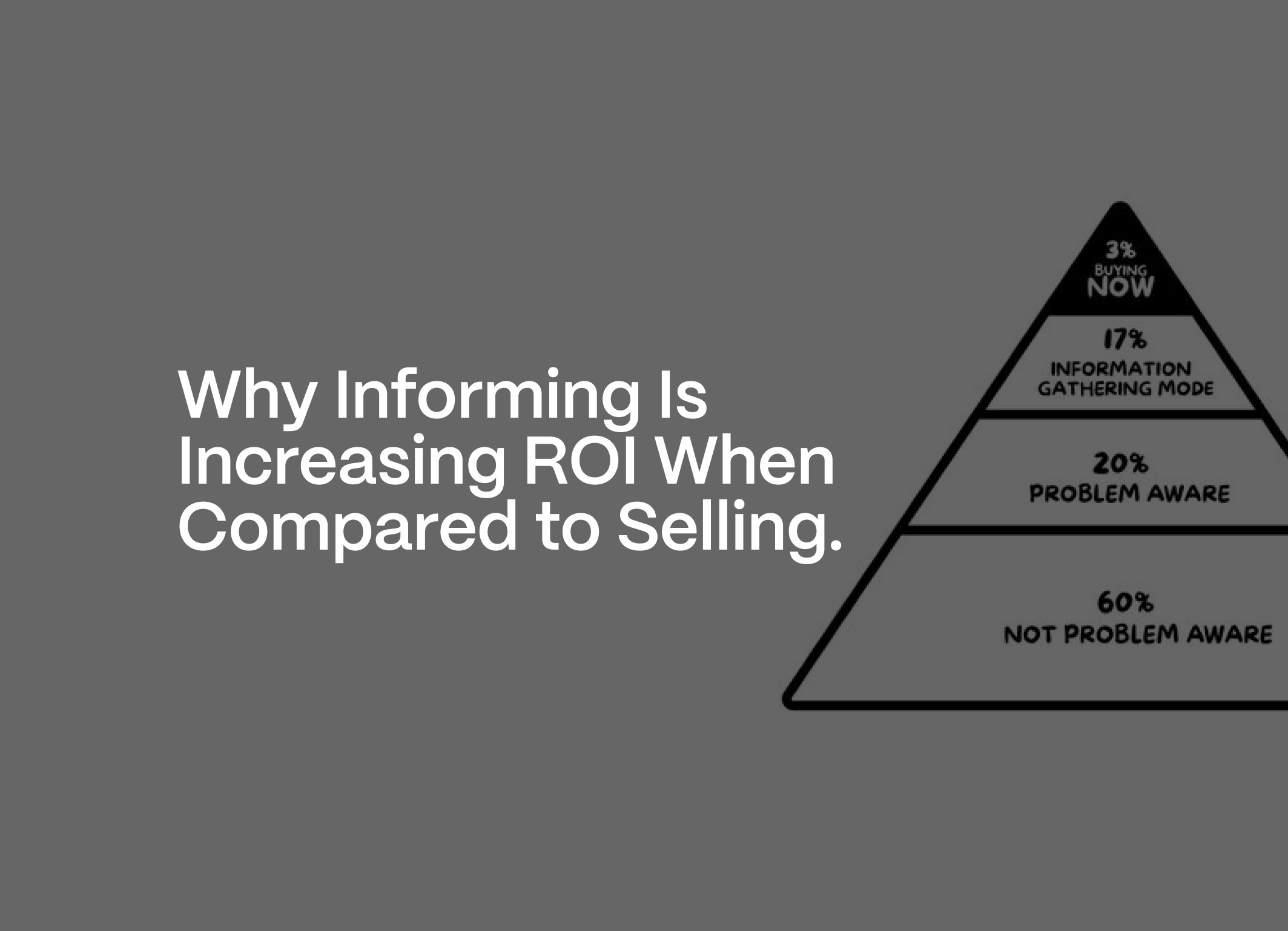
Recent insights suggest that modern consumers often take a more dynamic path that doesn’t follow a straight line. They might come across your product through various channels, go back and forth in the decision-making process, or be influenced by friends’ recommendations on social media.
Boost sales with tailored marketing funnels! Learn to engage customers effectively and increase conversions.

"Explore why SEO is crucial for online success. Learn about keywords, technical optimization, quality content, on-page elements, backlinks, monitoring, Google My Business, Search Console, organic ranking timelines, and continuous improvement for SEO success.
"Explore why SEO is crucial for online success. Learn about keywords, technical optimization, quality content, on-page elements, backlinks, monitoring, Google My Business, Search Console, organic ranking timelines, and continuous improvement for SEO success.

While WordPress remains a formidable contender in the CMS arena, its reliance on themes and plugins for customization and its steep learning curve may pale in comparison to the streamlined and intuitive experience offered by Webflow. Ultimately, the choice between Webflow and WordPress hinges on the specific needs, preferences, and skillsets of the user, but for those seeking a cutting-edge solution that seamlessly combines design, development, and content management, Webflow stands head and shoulders above the rest.
While WordPress remains a formidable contender in the CMS arena, its reliance on themes and plugins for customisation may be it's downfall.
Discover the power of informative marketing campaigns for small businesses. Engage and niche your audience and maximize ROI with strategic content.
Discover the power of informative marketing campaigns for small businesses. Engage and niche your audience and maximize ROI with strategic content.

In 2024, VR's integration into web design revolutionises online experiences, offering immersive browsing and enhanced consumer engagement.
In 2024, VR's integration into web design revolutionizes online experiences, offering immersive browsing and enhanced consumer engagement.

An effective website presence is a powerful tool for boosting lead generation. By optimising your website and harnessing the power of Webflow in partnership with a premium web development agency, you can attract more potential clients and convert them into paying customers. Remember, the key to successful lead generation is to provide value to your visitors and make it easy for them to take the next step in their customer journey.

Discover the synergy between branding & marketing for small businesses. Build a resilient brand identity for sustained growth.
Discover the synergy between branding & marketing for small businesses. Build a resilient brand identity for sustained growth.

In today's digital age, managing and updating your website's content is paramount to staying relevant and engaging with your audience. Content Management Systems (CMS) are the engines that drive dynamic web experiences, and when it comes to harnessing the power of CMS, Webflow stands as a game-changer.

So, you've got a website, and now you're wondering, "How can I effectively showcase it?" Fear not! This blog is your ultimate guide, featuring 101 actionable ways to exhibit your website with style and impact.

From concept to creation, this process is the culmination of our commitment to delivering exceptional digital experiences.

In today's digital world, visual storytelling is paramount. Our digital design and motion graphics services are designed to elevate your brand's digital presence, making it more engaging, memorable, and impactful.

Your website is not merely a virtual space; it's a dynamic tool for marketing and sales success.

The combination of HTMX and Webflow offers a dynamic duo that bridges the gap between design and functionality. By integrating these technologies thoughtfully, developers can create web solutions that not only look visually stunning but also provide a seamless and engaging user experience.

Incorporating AI into your digital marketing strategy can be a game-changer for small local service businesses. From data-driven insights to improved customer support and targeted advertising, AI offers numerous opportunities for growth and success in the competitive digital landscape.

We're excited to introduce our innovative subscription-based design service that empowers you to elevate your brand effortlessly.

This guide will allow you to navigate the intricacies of transitioning your website with confidence, ensuring a successful evolution in the ever-changing digital landscape.

In today's digital landscape, Search Engine Optimization (SEO) is the cornerstone of online success. It's the art and science of getting your website to rank higher in search engine results, driving organic traffic, and increasing your online visibility. Here's how to master SEO.

In today's competitive digital landscape, your brand is your first impression. It's the visual and emotional connection you make with your audience.

Incorporating web accessibility into your website is not just about compliance; it's about inclusivity and creating a better web for all.

By understanding the nuances of potential attacks, recognizing common vulnerabilities, and implementing proactive security measures with Webflow, you can build a digital fortress that stands resilient against the ever-evolving landscape of the WWW.

Building a website is a journey, not a destination. Embrace the process, learn from the challenges, and enjoy the exciting world of online expression.


The no-code revolution is not just about technology; it's about empowering marketing teams to realize their full potential. By embracing no-code tools, businesses can foster efficient collaboration, unlock creativity, and position themselves for success in the ever-evolving digital landscape.

In the fast-paced digital world, a successful online presence is more than just having a website. It's about creating a cohesive, compelling, and unforgettable digital experience for your audience. At C. Joseph, we understand this holistic approach, which is why we offer a unique blend of web development, web design, and brand identity design services under one roof.


In the crowded field of web development agencies, choosing the right partner for your digital journey is crucial. Here's why C. Joseph stands out as the best choice.

In the ever-evolving digital landscape, having a website that's optimized for lead generation is no longer a luxury; it's a necessity. Here's why investing in a new website designed for lead generation is a crucial decision:
Unlock growth potential with performance-driven marketing strategies. Elevate your brand with C. Joseph Studio's expertise in data-driven approaches.
Unlock growth potential with performance-driven marketing strategies. Elevate your brand with C. Joseph Studio's expertise in data-driven approaches.
Crafting high-converting landing pages in 2024 demands a strategic blend of compelling copy, impactful design, and continuous optimization.
Crafting high-converting landing pages demands strategic copy, design, and optimization. Trust C. Joseph Studio for expert results.
Website costs vary based on complexity. Simple sites start at a few hundred, complex ones can be tens of thousands. Quality is key for success.
Website costs vary based on complexity. Simple sites start at a few hundred, complex ones can be tens of thousands. Quality is key for success.
Revitalize your brand for success! Stay relevant with a refresh aligned to evolving goals, market trends, rebranding opportunities, and stakeholder feedback.
Revitalize your brand for success! Stay relevant with a refresh aligned to evolving goals, market trends, rebranding opportunities, and stakeholder feedback.
Unlock business success with Webflow: customizable, SEO-friendly, and powerful e-commerce.
Unlock business success with Webflow: customizable, SEO-friendly, and powerful e-commerce. Partner with C.Joseph Studio for expert services!
Crafting a high-performing website in 2024 demands more than just looks. Prioritize UX, accessibility, speed, and SEO with responsive design & fast load times
Crafting a high-performing website in 2024 demands more than just looks. Prioritize UX, accessibility, speed, and SEO with responsive design & fast load times
Is it time for a new website? Outdated design, lack of mobile responsiveness, essential features, or underperformance signal the need. Consult C.Joseph Studio
Is it time for a new website? Outdated design, lack of mobile responsiveness, essential features, or underperformance signal the need. Consult C.Joseph Studio
Contact us.
At C.Joseph Studio, our foundation is built upon the connections we forge with our clients.
We appreciate the opportunity to learn about your business and offer tailored solutions to address your needs.
